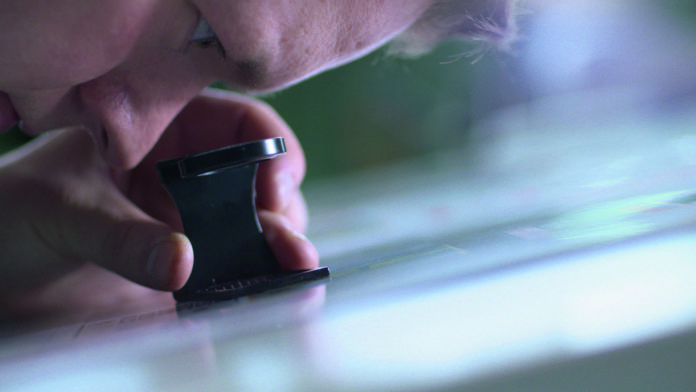
The font size is decisive for both legibility and text impact. But what exactly is the font size? Where is it measured and why are the letters of a Times typeface bigger than those of an English cursive font even though you have entered the same point value?
The web abounds with font size guidelines for students and other target audiences. For example, some universities still prescribe which typeface (Times New Roman) and point size (12 pt) to use for a dissertation which does not necessarily contribute to the legibility of a thesis. Many people are unsure when it comes to font sizes. And this is quite understandable given the lack of concise and understandable guidelines on this subject. High time to shed light on the matter.
Typographic units
When working with font, we don’t use the metric measurement system but typographic units. So when talking about font size, it’s not metres and millimetres we use but the smallest typographic unit, the point, established in the early days of printing which has survived to date. Different units of measurement were around over the years and centuries: The Didot point, a modified version based on the Fournier point, was the standard in the world of typography for a long time. At 0.375 mm, it was slightly bigger than today’s PostScript or DTP point which measures 0.353 mm . So if you enter a 10 pt font size in Microsoft Word or Adobe InDesign, you define that your font will have a size of 3.53 mm. In theory at least.
What is font size?
Let’s first define the term ‘font size’. Strictly speaking, the term is misleading since we don’t define the size of the font when setting the point value in InDesign, Word or other applications, but rather we specify the body height. In manual typesetting, the body height is defined by the height of the lead type or metal sort on which the actual font face, the printing surface of the type, is moulded. It is surrounded by blank or empty portions of the letterform, the so-called counters.
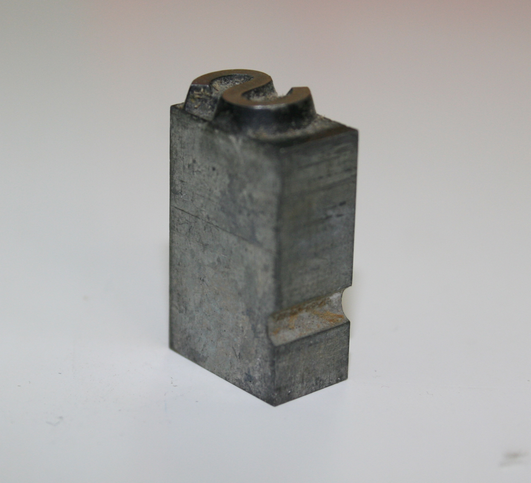
When Gutenberg set a 12 pt font, it was the metal type and not the printed letter that had a vertical height of 12 points. Hence, the body height is generally bigger than the printed glyph.
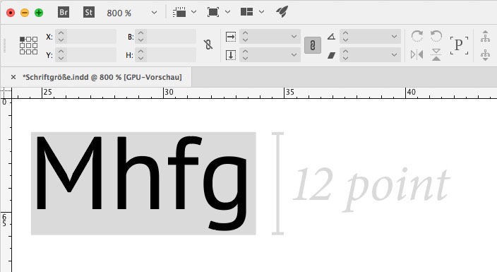
Fortunately, in our modern times we don’t have to carry around type cases anymore. In the age of digital type, we no longer work with lead type. But the body height is still an important reference measure in font design. After all, when you enter a 12 pt font size in InDesign, you define the height of a glyph’s bounding box which corresponds to the height of the metal body the type was cast on in the early days.
Different measuring results
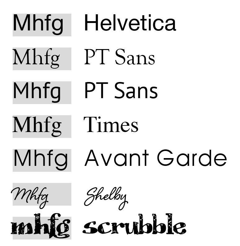
Now one could assume that you would merely have to take away 15 percent of counter space, i.e. the blank or empty portions of the letterform, for each font. So when entering 12 pt minus 15 percent, each font would then have an actually measurable height of 10.2 pt. But this is not the case as you have probably noticed: Two different fonts set in the same point size can appear similar in size or look surprisingly different. Apart from the optical size, which is also important, the usage of the body height is decisive for the actually measurable final size.
Typeface designers are free to decide how to use the body height to create a balance between printed glyph and non-printing space around it. Typographers that prefer a more open, airy feel may cut away a lot of the letter body, whereas other fonts make full use of the available design space by reaching the boundaries of a glyph’s bounding box and beyond.
Depending on how the available space is used, the actually measurable font will be bigger or smaller.
Different optical appearance
When considering sizes, we have to remember the effect a font has. There are fonts which are identical both in terms of body height (fonts set in 12 pt) and actually measurable letter size (same point size of the capital letters measured with the typometer). Nevertheless, they appear different in size and their legibility varies, especially in small point sizes. Why is that?
A letter has different anatomical features. The “p”, for example, extends below the baseline, the “a” stays in the middle, the “b” rises above the meanline, the “E” is located in the middle and at the top, the “O” ascends still a bit further and accented capitals win the height competition. This is illustrated in the graphic below:
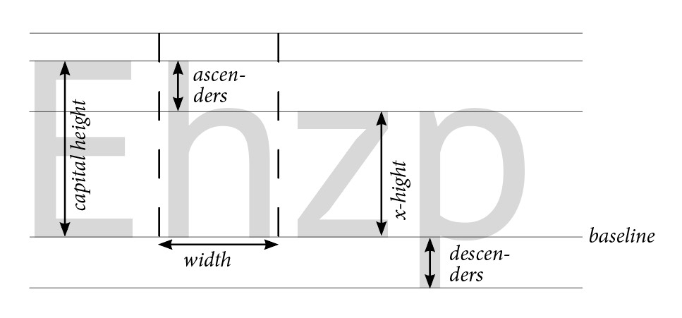
Besides shapes, line width and letter width, it is mainly the x-height that is decisive for the optical size. The x-height is the height of lowercase letters in a typeface, such as “m”, “a” or “z”. This height is different in relation to the cap height, that is of the letters “M”, “A”, or “Z”. Often the letters have a size ratio according to the Golden Ratio at a factor of 1.6 which means that the “M” is 1.6 times larger than the “m”.
But as always these proportions are only an average. Many fonts use other proportions and these work just as well. And although you have to be careful when making generalised statements about font size, it can be said that fonts with large x-heights compared to the cap height tend to appear larger than fonts where the x-height is relatively small.
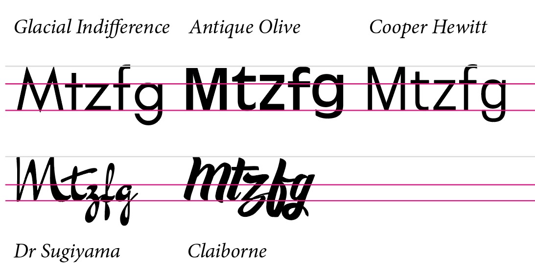
Remember: Not all 12 pt fonts are made the same. Depending on the font, the differences can be considerable: A 12 pt font can appear small like an 8 pt font or large like a 16 pt font.
Measuring font size
So what to do if you have a template and need to find out which font sizes are used, for example, to lay out a new flyer based on an old template?
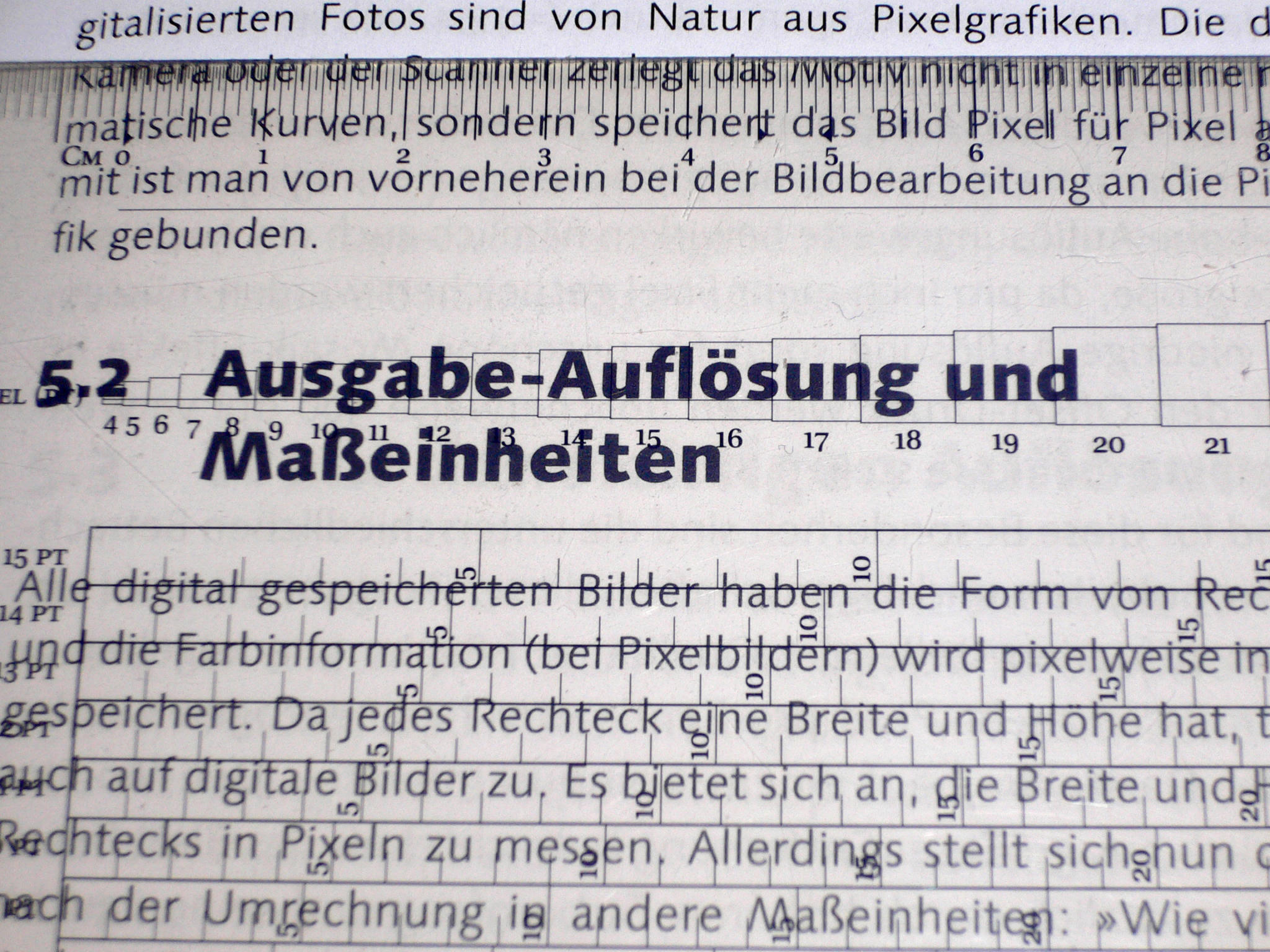
There are different approaches to accomplish this, but unfortunately no generally applicable standards. Using a typometer, which is a ruler divided in typographic points, we can measure printed fonts. But there are different ways to measure, different typometers and ultimately different point sizes here as well.
Hp height
The hp height is a standard measurement; it measures the height from the upper edge of the letter “h”, “b”, “d” or “l” to the lower edge of “p” or “q”. For this purpose, most typometers feature printed rectangles. All you have to do is find the rectangle which exactly fits the letters “h” and “p” and you know the font size. If only there wasn’t the matter of different body height usage described above…
The cap height
Alternatively, some designers work with the cap height which measures just the height of a capital letter without bowls, for example that of an “H” or “M”. But they, too, are difficult to measure, especially in case of cursive and handwritten fonts. Of course, the cap height is not the same as the point size you enter in InDesign and other applications. Here you have to specify the body height. So you can either draw from experience or you know where to look to calculate the font size or body height from the cap height.
Which font size for which purpose?
Given the situation explained above, it is hardly possible to give reliable font size recommendations. An easily legible font size for longer body text as used in magazines and books usually ranges between 8 and 12 points. To narrow down further, you have to know which font is used to make a reliable statement. The same applies to business cards or letterheads for which a font size between 8 and 12 pt is equally well suited. Captions, copyright information, footnotes and similar annotations may still be legible in 7 pt. But this strongly depends on the font used and on other details, such as the line length, the amount of text or the background. 6 pt fonts usually require the reader to wear good spectacles or are used for the fine print in contracts which nobody wants to read anyway.
Conclusion: We know that we know nothing.
There is no universally valid basis for body height usage and/or the font size this ultimately delivers. Font sizes are relative and a trained eye and experience are the most helpful tools to select the right size in addition to some basic values.
