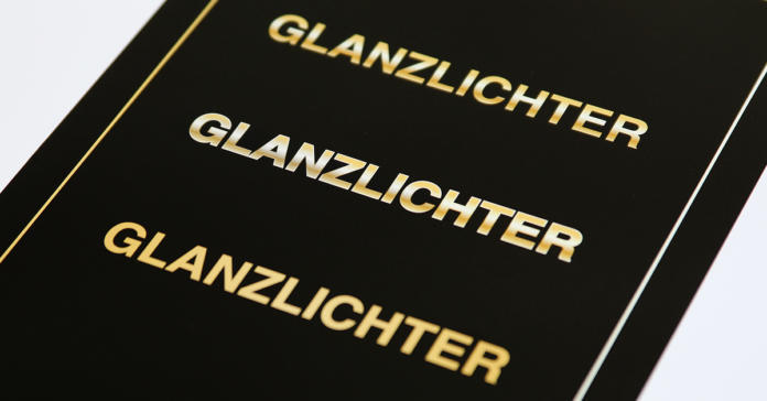
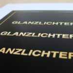
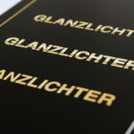
You don’t have to buy expensive jewellery to enjoy the luxury of gold. Make your graphic design projects sparkle too by adding a touch of class and sophistication using gold highlights. In this tutorial, you will learn how to use the process colours Cyan, Magenta, Yellow and Key to emulate a realistic gold effect in your print project without using a spot colour.
Contents of this article:
- What’s special about gold
- A classic CMYK gold
- A plastic gold effect in CMYK
- A subtle gold effect
- The right paper for gold in CMYK
What’s special about gold
Gold reflects light. This property is of course difficult to reproduce 100 per cent on paper. For this purpose, Adobe InDesign provides a powerful gradient tool that effectively emulates a metallic gold effect. The choice of paper also influences the impact of the gold effect.
A classic CMYK gold
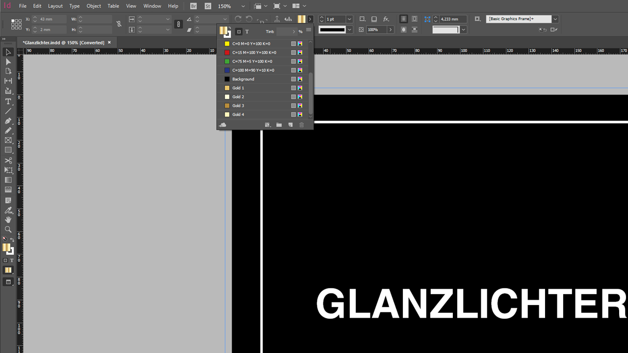
In our first example, we will create a gold effect consisting of four different brown and ochre hues. Before we can define the actual gradient, we first have to create each colour separately. To do so, open the Color Theme and click the New Swatch button. Subsequently, double-click the newly created colour to open the Swatch Options dialog box. In this window, you assign the name of the colour and the colour values for the first colour.
In this example, we name the four colours “Gold 1” to “Gold 4” with the following values:
- Gold 1: C9 M22 Y65 K2
- Gold 2: C0 M0 Y21 K20
- Gold 3: C21 M39 Y81 K17
- Gold 4: C1 M2 Y35 K0
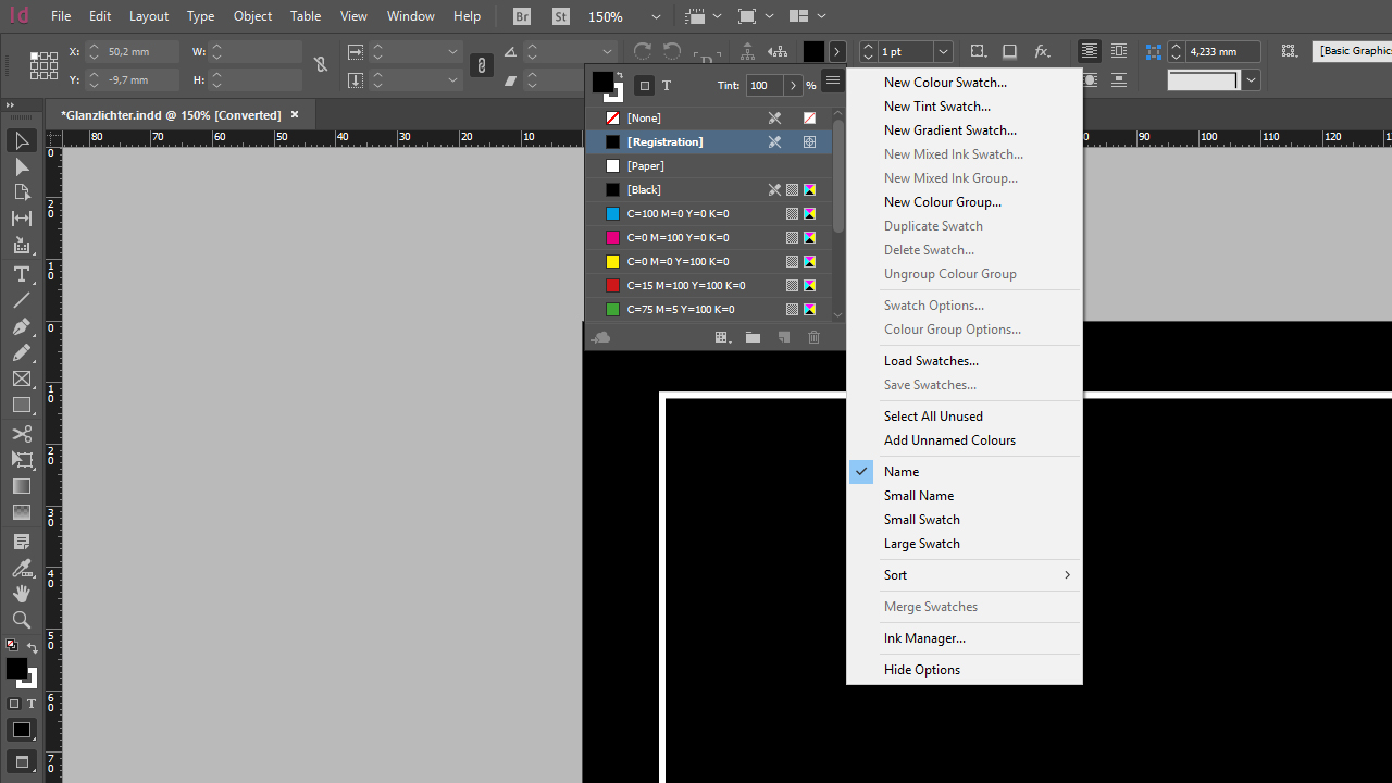
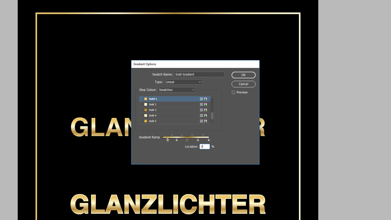
Once you have created the four colours, open the Color Themes and click the icon with the three horizontal lines to open a dropdown menu. Click New Gradient Swatch. In the new window, first assign the name as you would do for a standard colour. In this example, the name is “Gold gradient 1”. Choose Linear in the Type field. The area for setting the colour is still greyed out and not editable. This changes once you click on one of the colour stops on the Gradient Ramp in the lower part of the window.
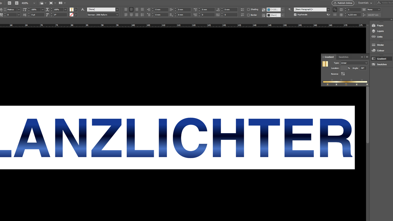
You can move the colour stops to any position along the Gradient Ramp. Also, you can add more colour stops by clicking below the Gradient Ramp. To delete a colour stop, simply left-click it and drag it away from the ramp area. The Gradient Ramp determines the gradient from the upper to the lower edge of an object to be coloured. Click on one of the colour stops to select it and assign colours.
If you click on the first colour stop, the Stop Color dropdown menu for assigning a colour is enabled. Use the Stop Color dropdown menu to select the Color Swatches panel. Now you can assign each colour individually. Add three more colour stops and assign the corresponding colours “Gold 1” to “Gold 4” to them. The last colour stop is assigned to “Gold 1” again.
Click OK to confirm the settings and the gradient appears in the Color Themes like a normal colour. Now select the text or the object and colour it with the “Colour gradient 1” colour.
Depending on the InDesign version, it can happen that the effect is initially displayed from left to right instead of top to bottom. To obtain the desired result, open the Gradient panel by clicking Window > Color > Gradient. In this window, you can now set the angle of the gradient.
A plastic gold effect in CMYK
An outline makes the gold effect even more plastic. By defining “Gold gradient 1” as a contour colour in addition to the fill colour, the gradient appears like and edge and emulates the special gold reflection effect. You can change the angle to adjust the intensity of the plastic gold effect.
A subtle gold effect
If you prefer a more subtle effect, we recommend our third gold colour to add a less obvious but still elegant touch to your design. First, we need two new colour swatches. They have the following values:
- Gold 5: C7 M21 Y56 K0
- Gold 6: C18 M34 Y80 K0
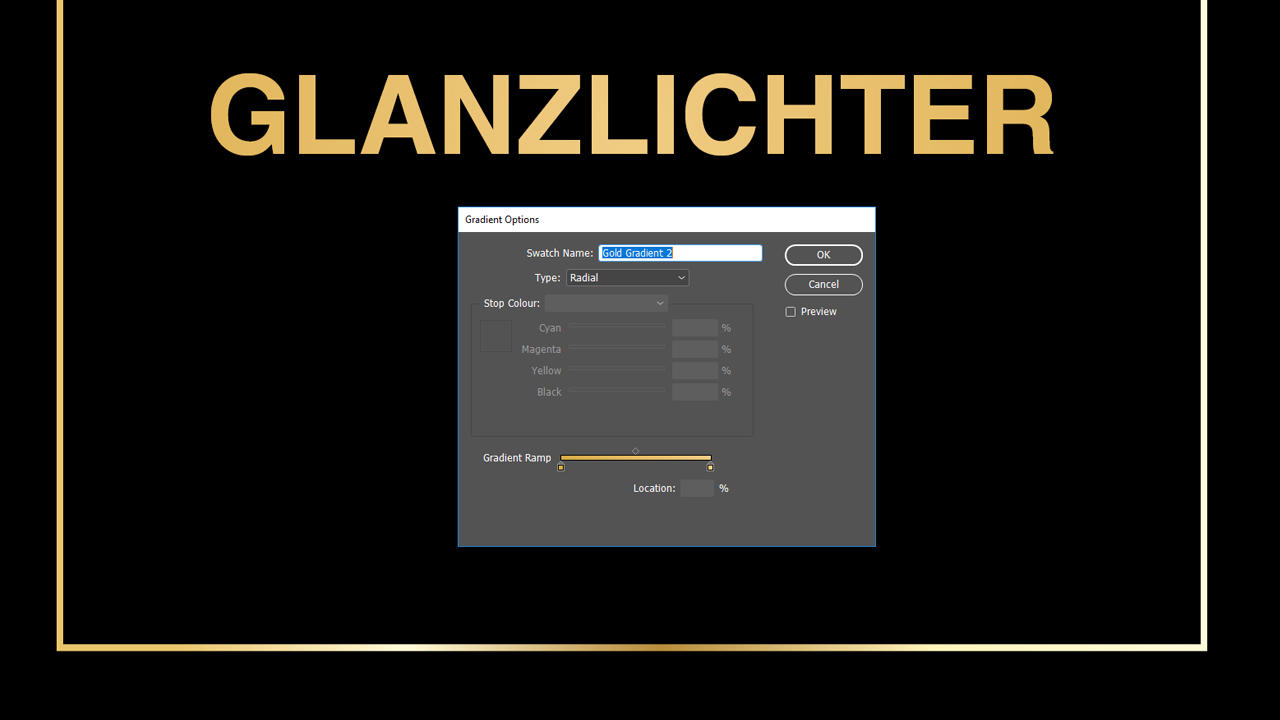
Create another colour gradient using the Color Themes. Assign “Gold 5” to the left colour stop and “Gold 6” to the right colour stop. Change the Type field from Linear to Radial to make the gold effect lighter from the outside to the inside. Name the new gradient “Gold gradient 2” and click OK to confirm your settings., As in the previous example, just select the object and fill it with the “Gold gradient 2” colour. The result is much more subtle but still very classy.
The right paper
The choice of paper mainly depends on the purpose for which you want to use your gold effect design. To advertise a product, we recommend glossy coated art print paper. The reflective properties under light enhance the gold effect and give the product a sophisticated appearance.
Uncoated or matt coated paper should be preferred if you want to emphasize the gold effect. There is no reflection which makes the gold effect pop out clearly. This works best on matt paper with a dark background.
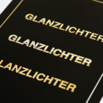
Our CMYK gold on glossy coated art print paper
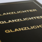
Our CMYK gold on matt coated art print paper
Credits:
By media designer Christoph Ullrich.
