Designing a logo is an art in itself. The aim of a logo is to represent a company or product. To make sure that the logo is appropriate for the company or the product, there are some points you have to keep in mind. We will use the fictitious example of “STARMUSIC – Dein Musikhaus” to demonstrate how to create a logo and what a good logo is all about.
Contents of this article:
- Four steps to create the perfect logo
- Criteria for a logo
- Creative process
- Demo project: “STARMUSIC – Dein Musikhaus”
- Our workflow to create the perfect logo
Four steps to create the perfect logo
1) Brand recognition:
The purpose of a logo is to represent a company or a product. Therefore, specific characteristics and features of the product or company should be incorporated in the logo. This can be a simple shape or a special colour, for example. The goal is to design a unique and memorable logo that will stand out from the crowd.
2) Black and white compatibility:
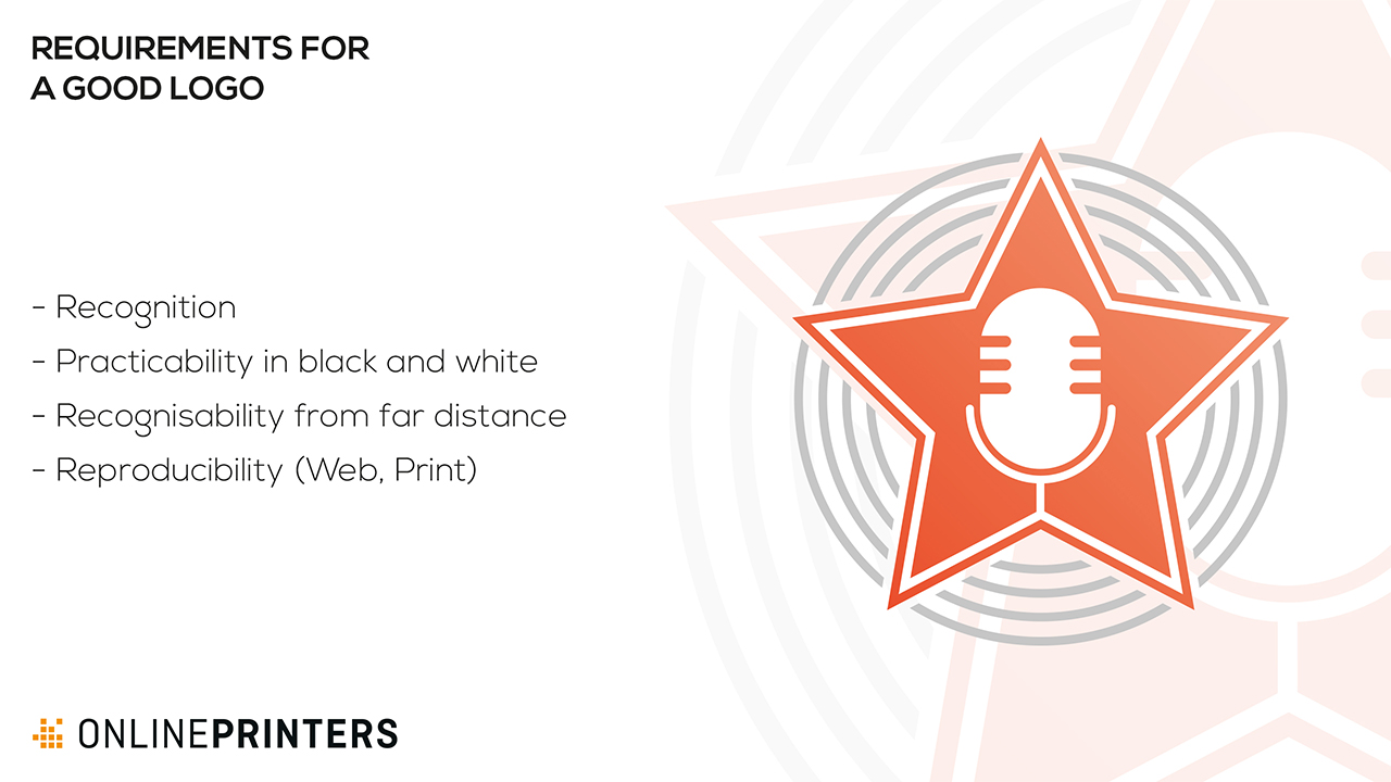
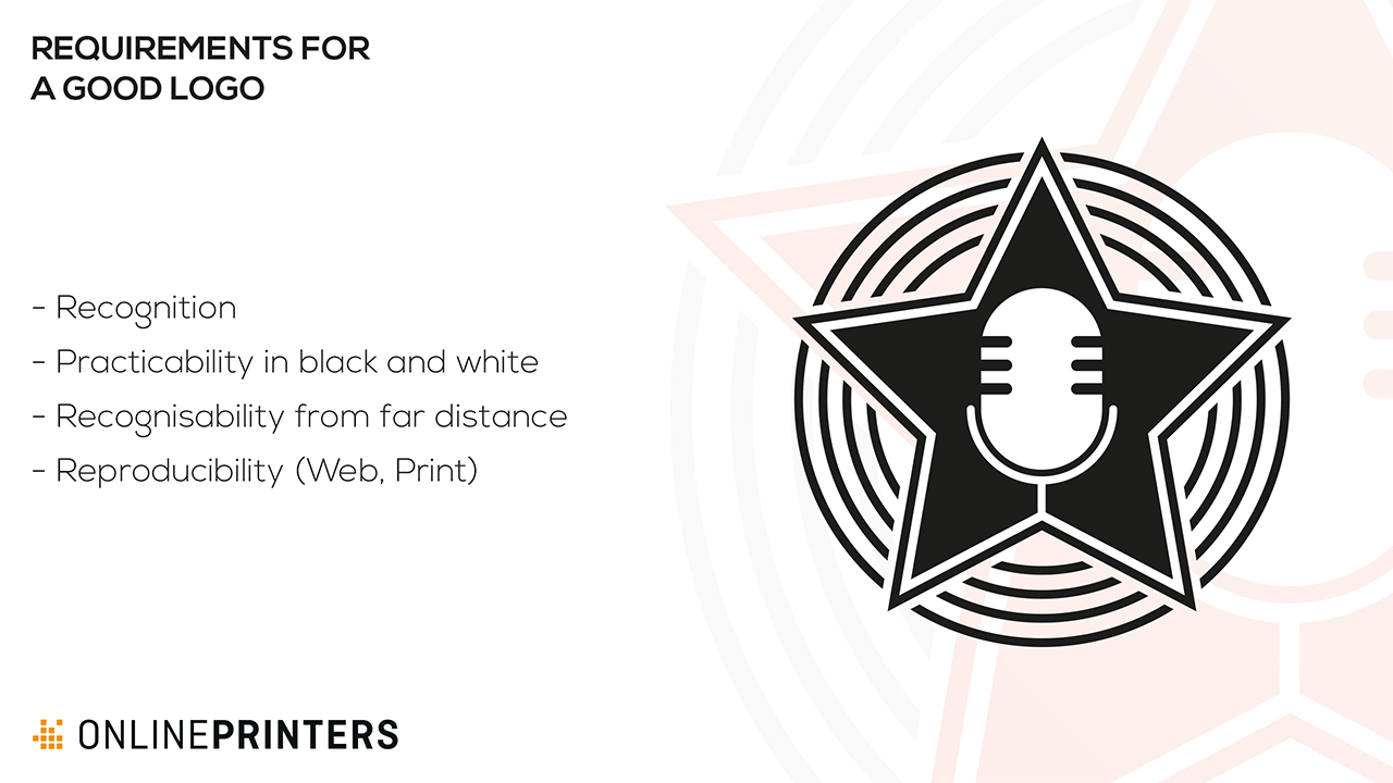
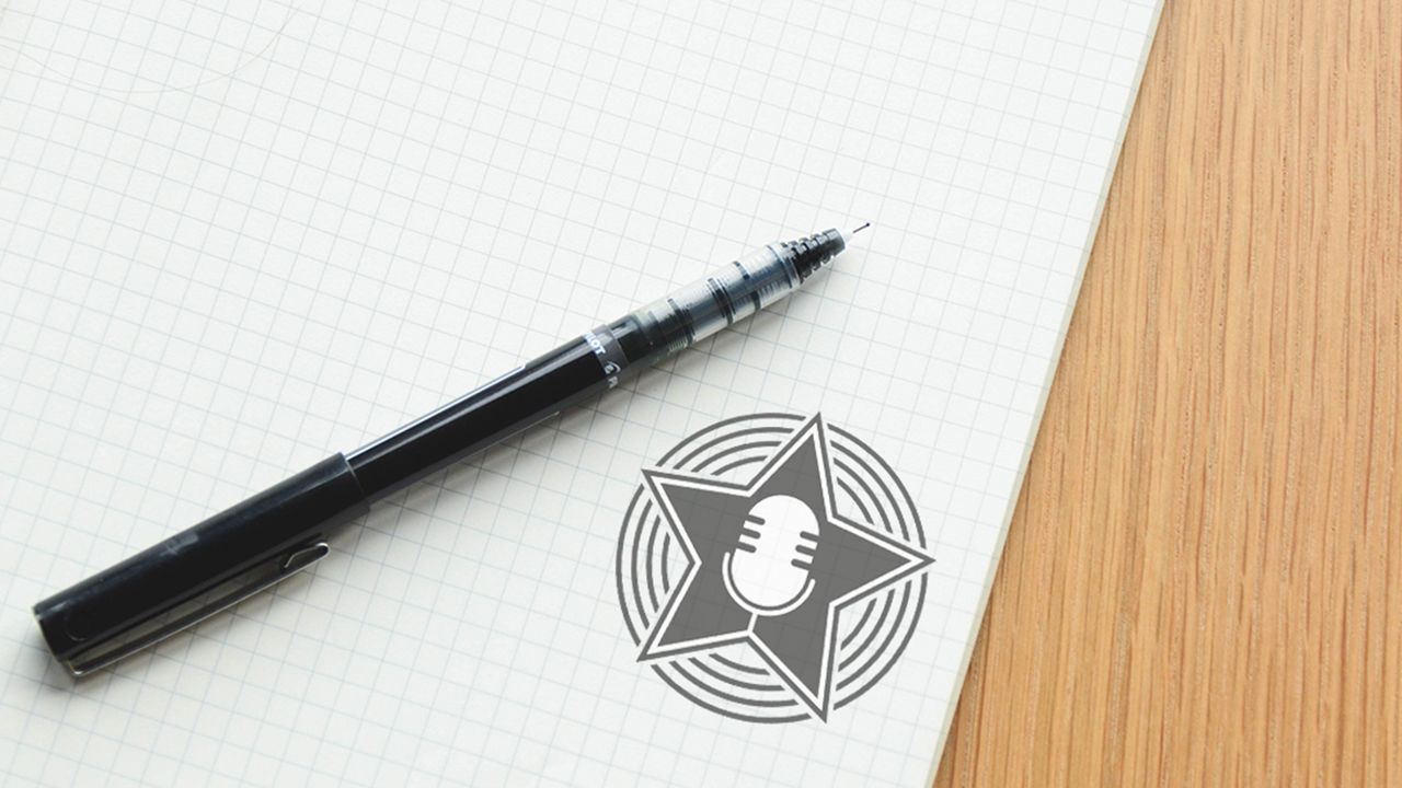
Each logo should also work in black and white so that it can be used universally for print or web applications. The basic message of a logo should not get lost in the monochrome version.
3) Visibility from a distance:
The logo must be easy to identify from a certain distance. Therefore, you should design the proportions of lines and contours so that they are easily visible from about three to five metres away.
4) Scalability:
To make sure that your logo looks good in magazines, on walls or in the internet, you should design it with scalability in mind. Vector graphics is a key term in this context. It allows free scaling of the logo to be used anywhere whether big or small.
Criteria for a logo
A lot of different factors influence whether the logo ultimately has the desired impact.
Selecting the colours:
Red is associated with strength, power and energy, whereas green represents nature, environment and health. So when choosing the colours to be used in a logo, you have to think of how people will perceive it.
The power of shapes:
Particular logo shapes send out particular messages: A circle symbolizes unity while a rectangle or triangle signals stability.
Selecting fonts:
The font can make a major contribution to the impact a logo creates. Using Comic Sans, for example, will not be able to convey a sense of trust and professionalism which is crucial for any logo. Cursive fonts have a more playful and creative character, whereas serif typefaces create a sense of respectability.
The creative process
The way to the perfect logo can be very long, because it is a hallmark that should represent a company or product – often for many years. A lot of questions need to be answered: Which corporate colours should be used? Which aspects of the company or product should the logo represent? Which elements must the logo include?
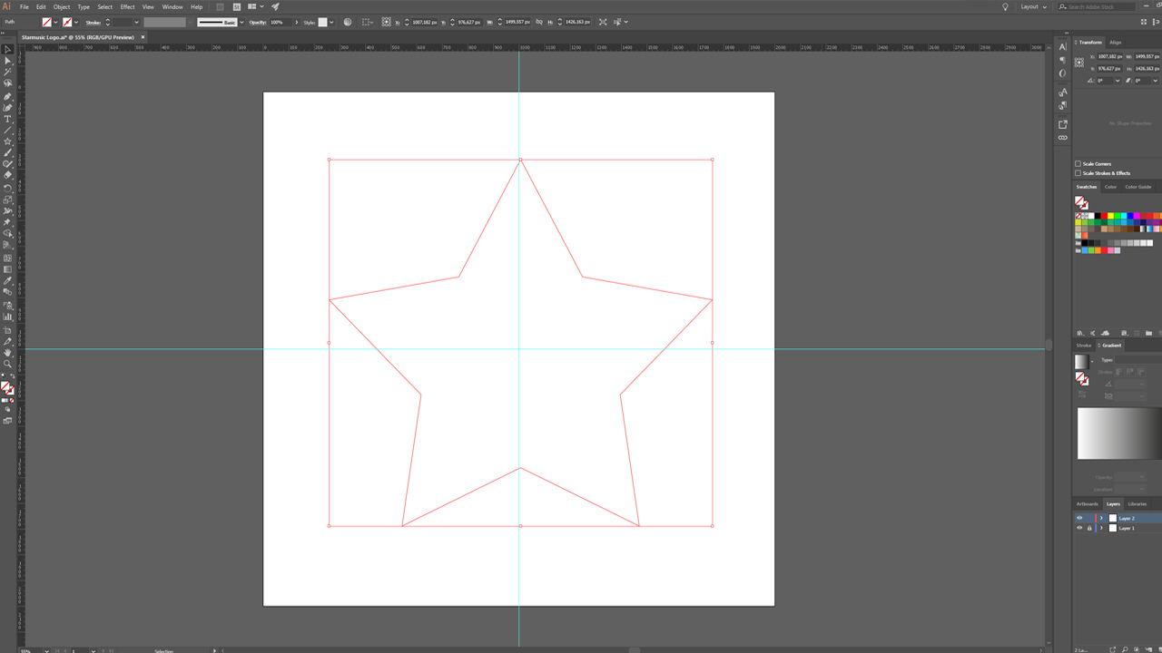
In the next step, you should grab a pen and make sketches and scribble your logo ideas on paper. Once the logo has taken shape on paper, you can proceed to transform the best sketch into an inspiring logo in Adobe Illustrator. To do so, you have to fine-tune outlines, add colours and maybe come up with a wordmark already at this point.
Demo project: “STARMUSIC – Dein Musikhaus”
We will use this example to illustrate what a typical logo design process can look like in practice.
The scenario: The music store “STARMUSIC – Dein Musikhaus” needs a logo.
The following criteria should be considered in the design process.
- The logo should refer to the name STARMUSIC.
- The colour theme should come across as modern and fresh.
- The “Dein Musikhaus” slogan must be incorporated.
- The store’s corporate font is Zona Pro.
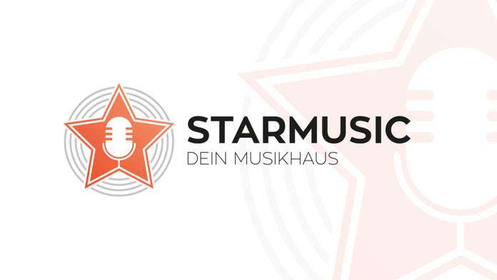
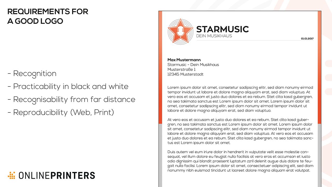
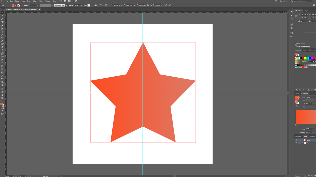
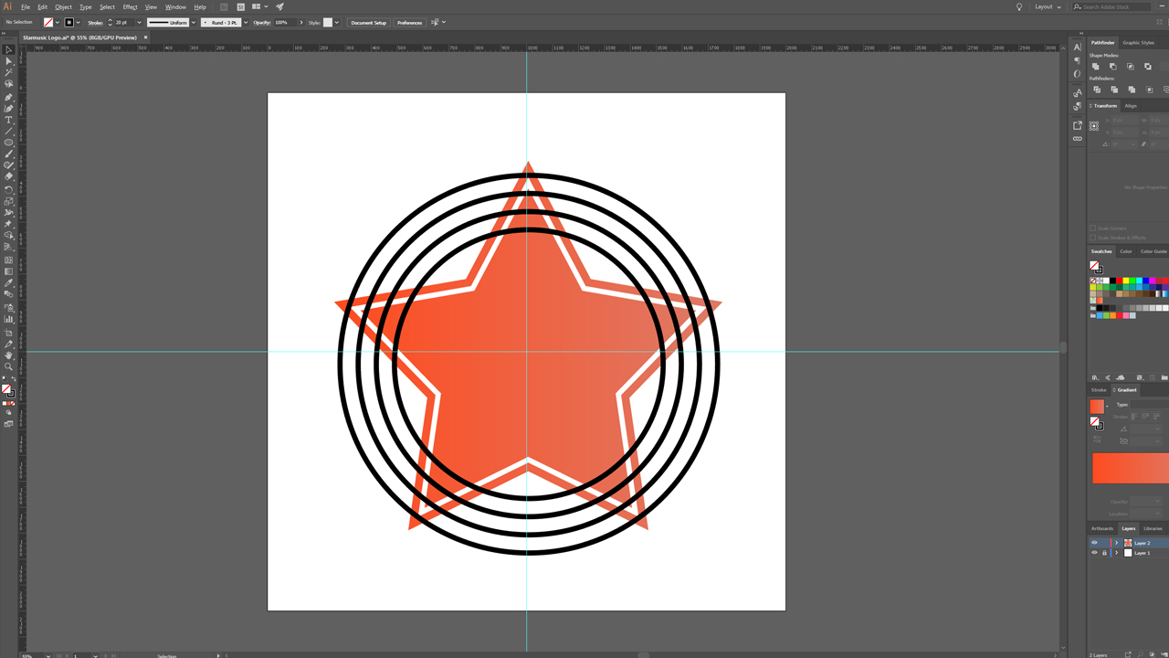
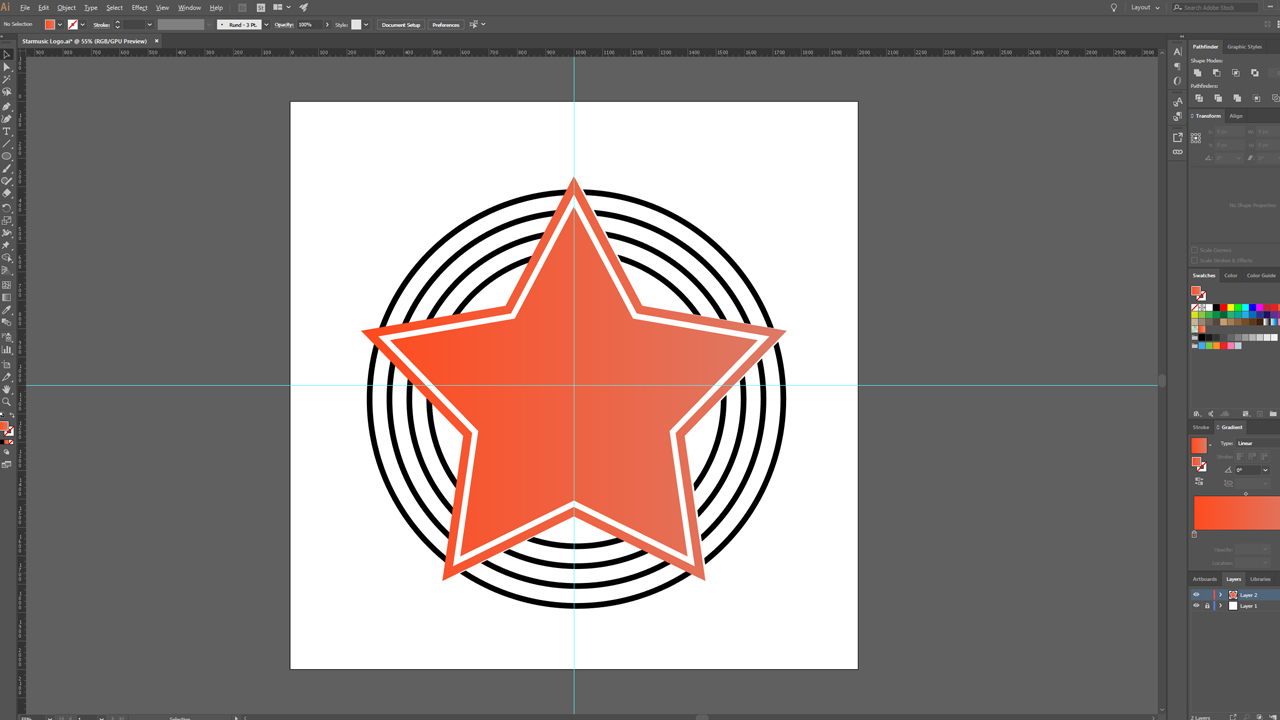
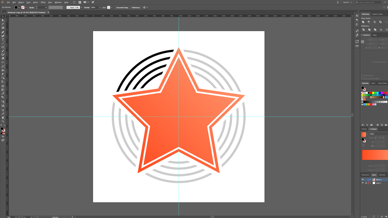
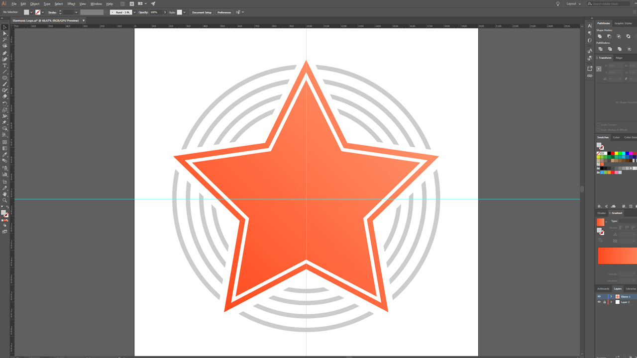
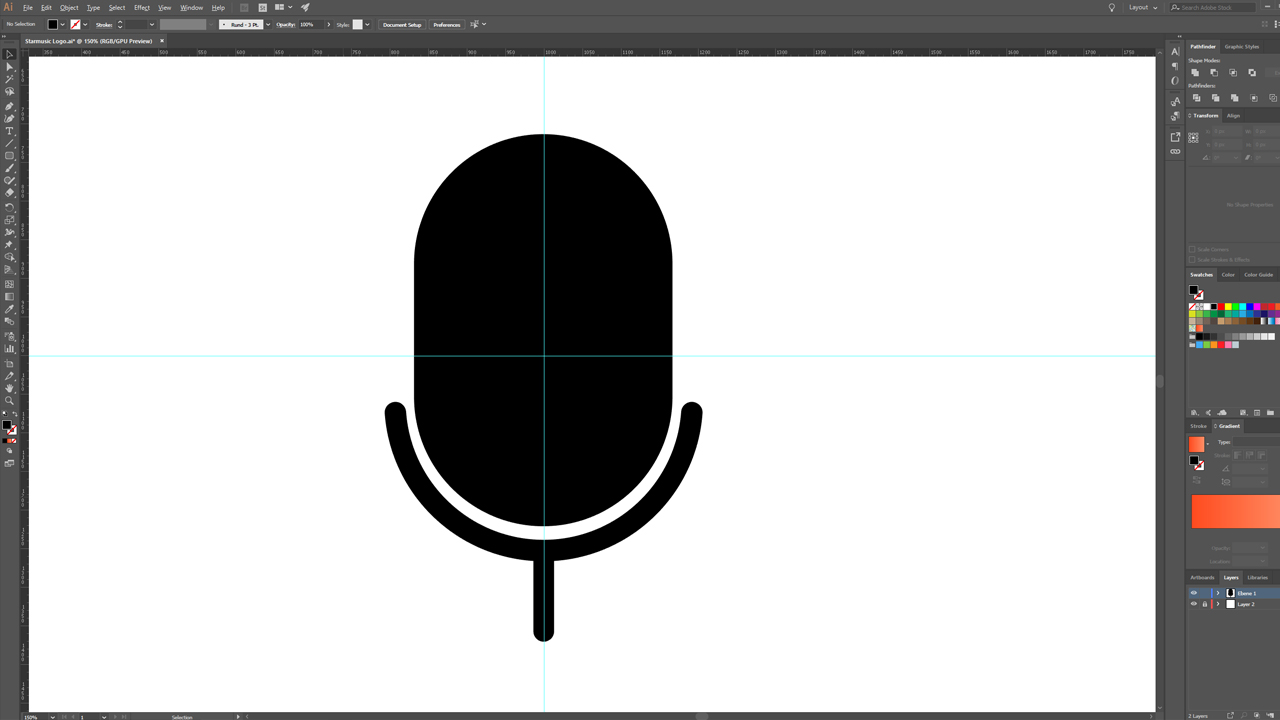
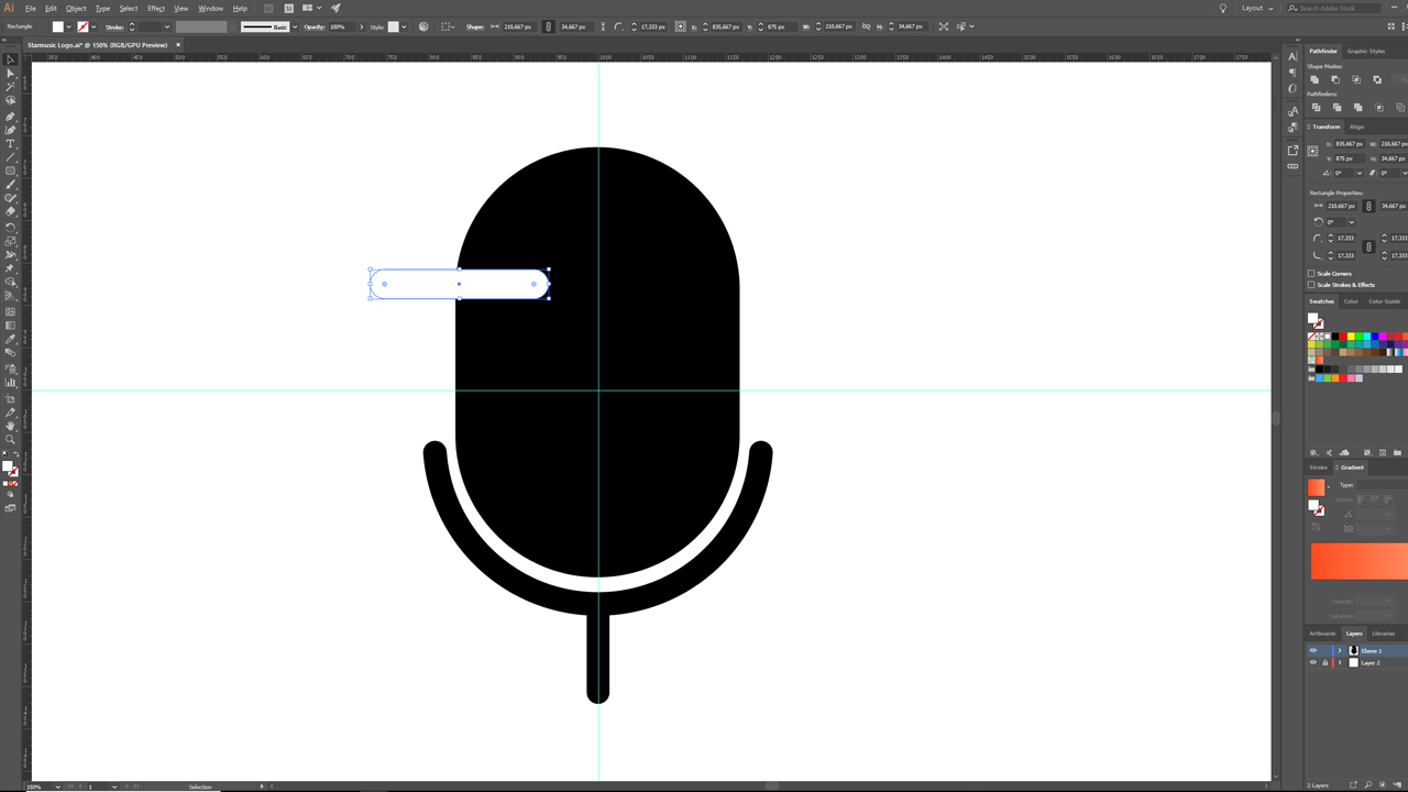
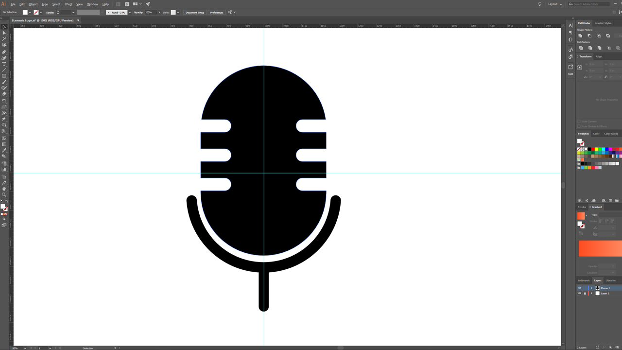
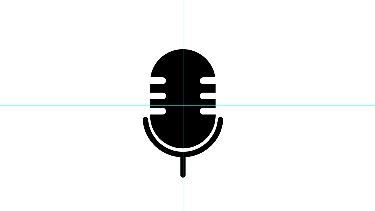
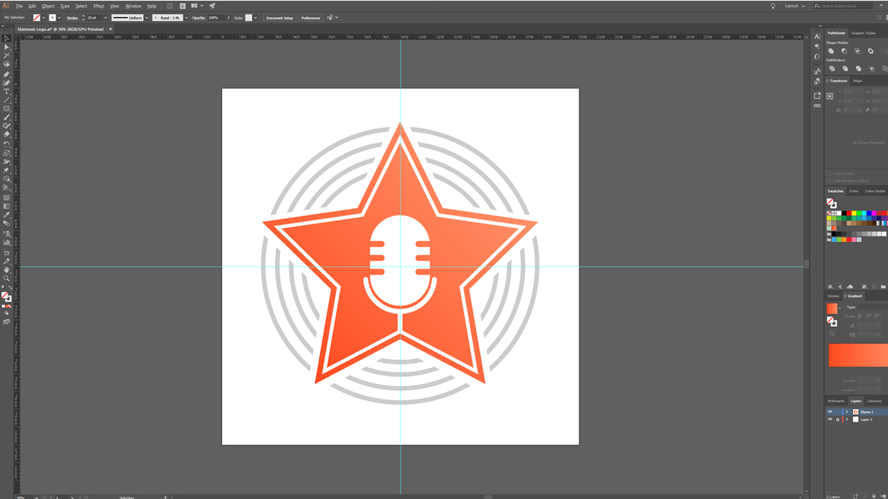
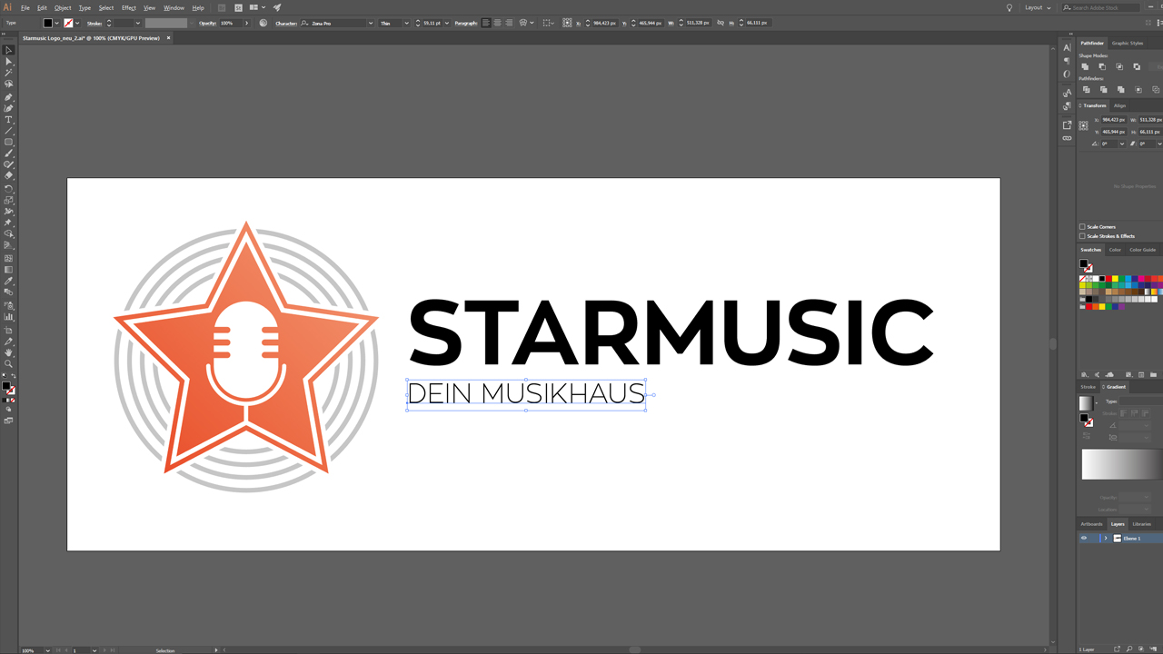
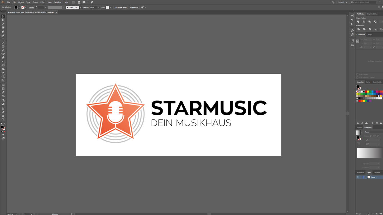
A star shape is obviously ideal to create a logo for “STARMUSIC”. It could be combined with an object that is typically associated with a music store such as a microphone which is easily recognized when looking at the logo. Subtle soundwaves sketched around the star make the logo complete.
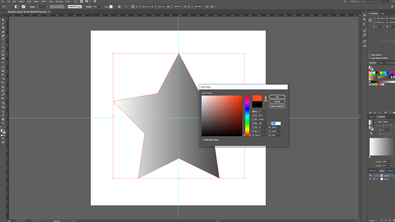
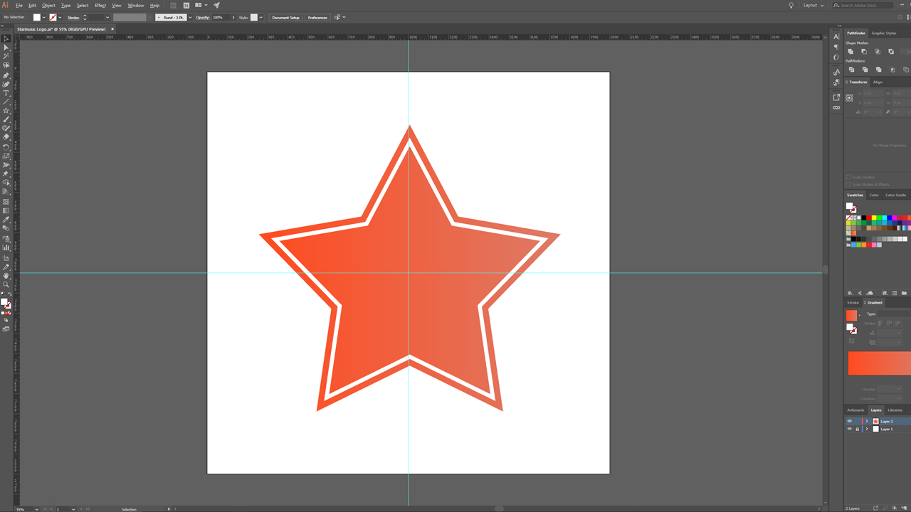
A fresh and modern colour is now selected in Illustrator. We go for a bright, almost neon orange. The gradient to a lighter orange hue makes the logo appear more vibrant. When designing the individual strokes, make sure that the outlines are heavy enough to be easily visible from a few metres distance. The soundwaves around the star shape are kept in a subtle grey to give more emphasis to the main colour orange.
Finally, we create the company’s wordmark using their corporate font and position the slogan “Dein Musikhaus” below the company name “STARMUSIC”.
Our workflow to create the perfect logo
Star and soundwaves
Microphone
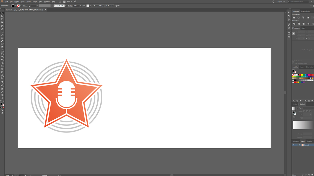
Merging the logo
The resulting high-recognition logo can be used universally in any context:
Credits:
By media designer Christoph Ullrich.
